
Pure & Peaceful
A UX digital review to increase user efficiency, increase sales and build community.
UX website audit, User Research, Competitor Research, Personal Creation, Prototype Development, Photography Direction.


OVERVIEW
Pure & Peaceful is a Brooklyn, NY based company that creates 100% plant and mineral cleaning products. They believe that caring for your environment and caring for your health should go hand in hand and are focused on helping their clients find harmony between the two. Using potent, botanical ingredients and hand-selected essential oils of the highest therapeutic grade, they are redefining the meaning of “clean.”
The goal of this project was to analyze the Pure & Peaceful visual deliverables, dig deeper into their client needs and to propose growth strategies to nurture existing customers while attracting new clients.
USER RESEARCH
To further understand the existing client bases priorities, two surveys were created; one to send out to the Pure & Peaceful mailing list and the other for Instagram. The survey to the mailing list was more in depth, with the goal to determine:
What was the client’s path to purchase (online or physical store)
What type of household cleaning products they have bought in the past 6 months - 1 year
What competitor brands had they heard of
How do they discover new household cleaning products (word of mouth, advertising, etc)
In addition to these mostly quantitative questions, a series of qualitative questions were also posed, to determine the priorities of the client persona:
Importance of company having a social mission
Pleasant scent of household cleaning products
Effectiveness of household cleaning products
Women / BIPOC owned
Sustainability story
Subscription plan available for purchases
The social media survey conducted through Instagram was limited to 7 questions since the attention span of the casual social media browser felt shorter than an email survey.
Questions touched on how clients discovered new household cleaning products, where they shopped for cleaning products as well as a ‘this / that’ quiz. An open source question of “what’s most important to you when deciding to buy” was posed as well.

Based on the email / Instagram survey results, Stakeholder interviews and contextual inquiry, I came up with the Pure & Peaceful persona.

COMPETITOR RESEARCH
Identifying and examining the Key competitors to determine their strengths and weaknesses was crucial in determining any opportunity areas for Pure & Peaceful to expand on.
Competitors all had a cohesive, strongly branded look with a variety of content.
Lifestyle focused, with a balance of diversity and product-in-use images.
Integration of educational content, utilizing Instagram Reels and YouTube.
Founder stories and images, which also showed the most engagement on those posts.


INSIGHTS
From the user surveys, contextual analysis, competitor research and contextual clues, I had a better understanding of the motivations and needs of potential and current clients.
While consumers want a household cleaner that won’t affect their health or the health of their family, that need is in a delicate balance with price point.
Anyone can state that they value their health, but consumer behavior is more telling (“Do as I say, not as I do” comes to mind). In a world where next day / free shipping is the new ‘normal’ having an expectation of low to non-existent shipping costs proved to be a point of friction, especially to potential new clients that have never tried the Pure & Peaceful products before.
A word of mouth referral carries more decision making weight than a flashy ad.
While only 33% of survey respondents felt ‘loyal’ to their particular brand of cleaning products, 62% of respondents were more likely to try a new product if discovered through a trusted source, such as a friend.
Challenges with the existing Pure & Peaceful website
The original landing page is filled with ambiguity.
The path to purchase isn’t clear; depending on how a user looks for a product, overlay windows that take up the entire screen make the user feel like they’ve navigated away from the main website. There are also too many individual, hyper-specific tags for the search, rather than broader categories which places the burden of the search on the user. At the very top, a sensitive pain point (as discovered from the user research) is listed showing a perceived high price to get flat rate shipping. The navigation menu shows 6 choices, and doesn’t prioritize the products (when this is an eCommerce site). The CTA above the fold is almost hidden, with the button color nestled into the background image.

The unique differentiator of the product is highlighted inconsistently throughout the website
While differentiating the Pure & Peaceful products is important in such a crowded market space, devoting a large amount of the landing page to their unique addition of adding therapeutic grade essential oils to their products detracts from promoting their products; a better balance of commerce and education needs to be made. Related to this, the use of these unique scents wasn’t highlighted alongside the products to reiterate this to the user.

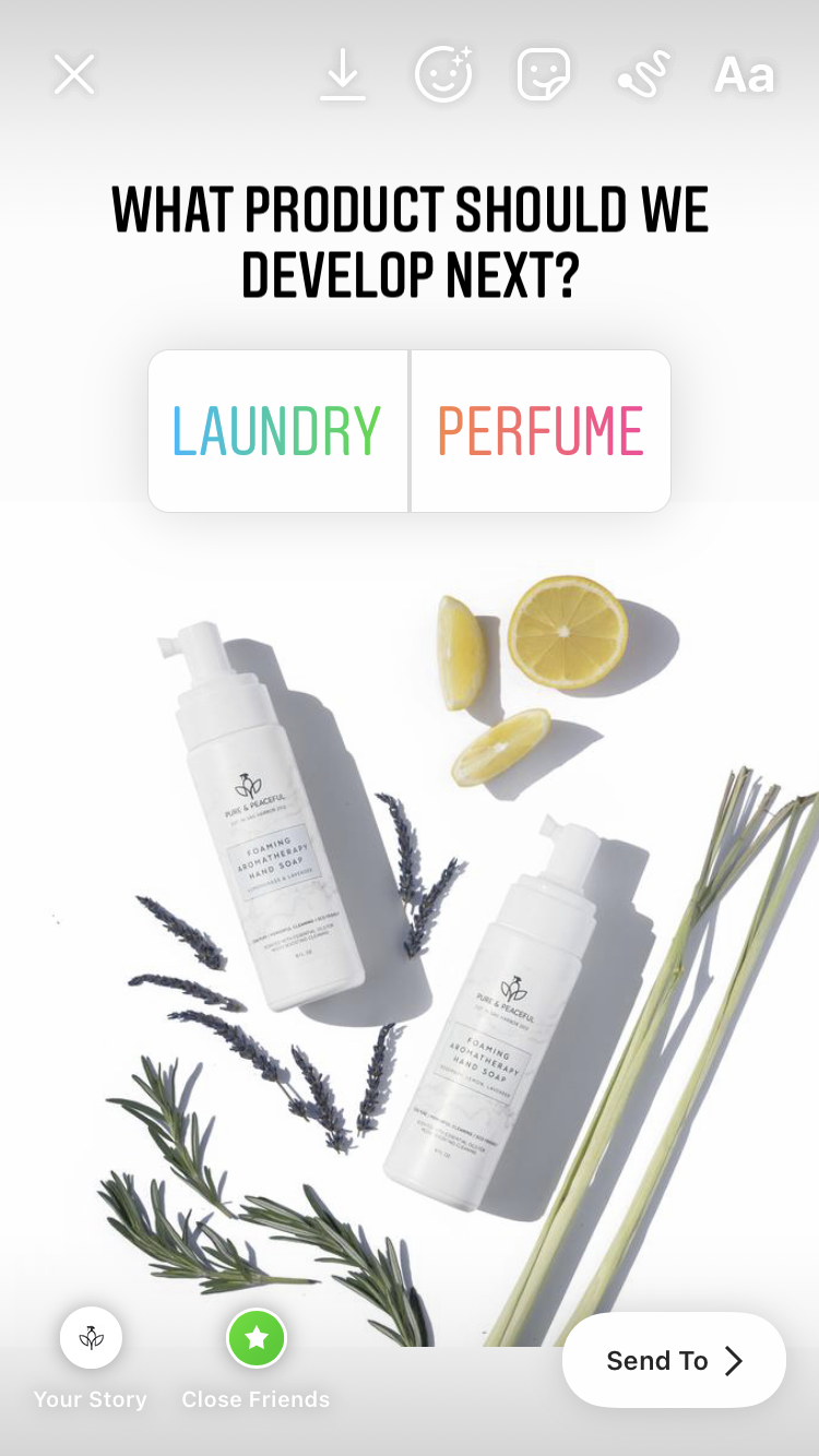
Lack of opportunity to build a sense of community
From user research, trust was a large factor in gaining traction to new clients. Pure & Peaceful did not currently have any kind of community building, or any visuals to support client testimonials / reviews. Written reviews are nice, but putting a face to the review or ‘before / after’ images are far more compelling especially when it comes to cleaning products!

Solutions in the redesign

Clearly communicate what products are being offered and how to purchase them.
A pared down navigation menu, with priority to “Shop” and “Learn”. A clear CTA above the fold to “Shop Bundles” also promotes product front and center. Revised copy above the CTA iterates the Pure & Peaceful ethos of being a 100% plant and mineral based product.
Highlight Best Sellers
To further prioritize the product, the best sellers are listed directly under the main image, with the ability to add to cart directly accessible underneath. Products having a pleasant scent were also important to existing users, so the essential oils used in each product are listed directly below the product name. Adding the price to the add to cart button provides transparency to the purchaser, but de-emphasizes the cost as part of the description.
Feature unique product attributes
Pure & Peaceful is the only product in the household cleaning space that uses therapeutic grade essential oils without synthetic fragrances. Their mission is to provide a completely natural product while educating people about the health hazards of synthetic fragrances, emulsifiers and fillers that normally are found in household cleaning products.
Build connectivity, trust and relatability
Adding compelling before / after photos to accompany client testimonials / reviews is a visual way to build relatability with others.
A list of publications / articles / accolades that the product has garnered is featured but not emphasized to further build trust in the minds of users.
A photo featuring the founder with an accompanying message builds a connection to the face behind the company, offering another opportunity to build connection.
CONCLUSIONS
Testing assumptions is always necessary; yes, people want to buy more cleaning products in the pandemic, but sorting through and standing out in a very crowded marketplace was challenging at best. Making the website easier for clients to use was paramount; it’s hard to increase sales with there are multiple clicks in the way. Community building is the fastest way to build trust and connectivity (especially digitally!) and with minimal effort, can yield favorable measurable results. I also learned that most products can hide harmful chemicals under the umbrella term “fragrance”, so educate yourself and stay healthy!
